

Brand identity. Branding.
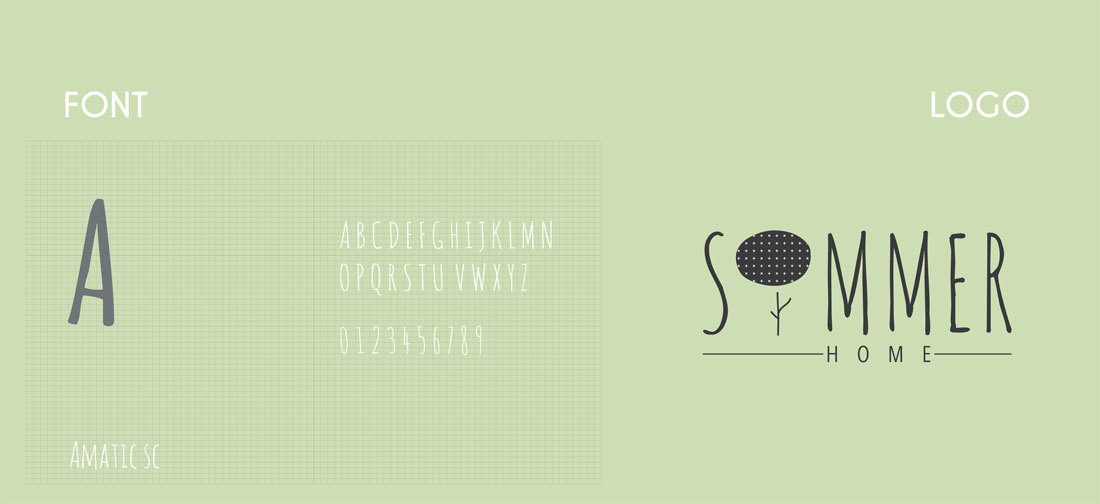
The brand wanted a modern yet scandinavian feel to the entire thing. The logo was designed to have a natural yet minimal feel to it.
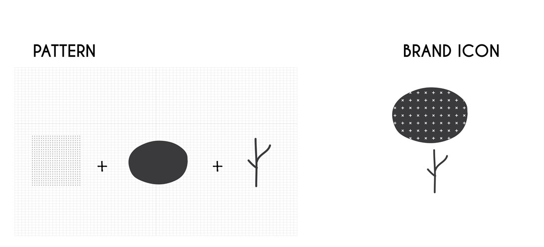
The brand icon in a shape of a pollen plant was used keeping in mind babies, since the brand offers home linens and decor for kids.
The colour palette used was put together keeping in mind how children like warm clean colours as they do not put pressure on the eye and keeping it fresh which psychologically keeps the child happy and content.
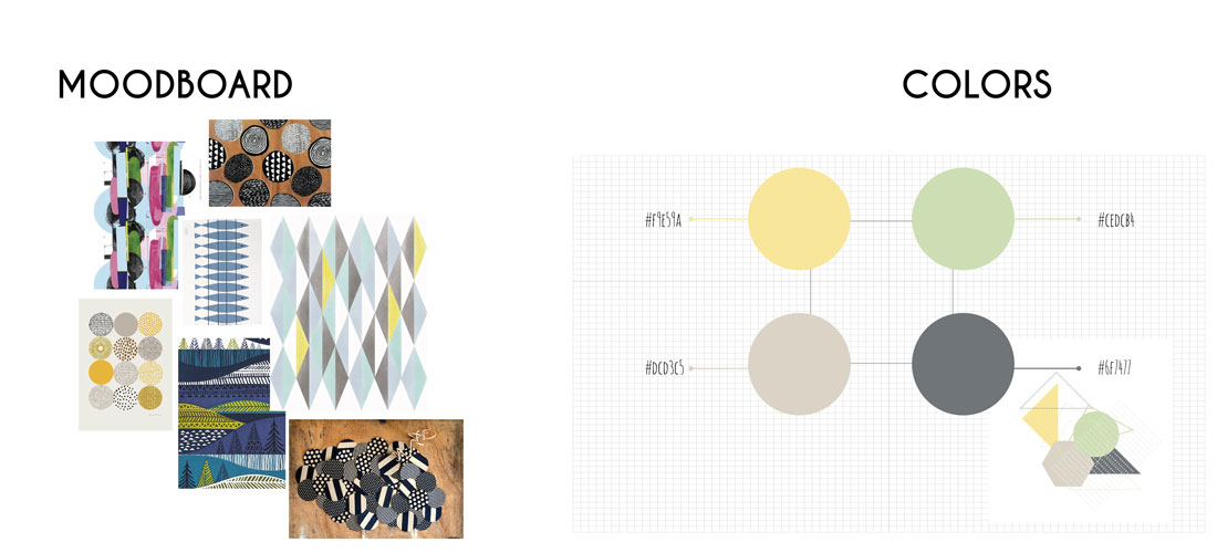
The design language for brand identity needed to be warm, cosy, clean and needed to have a minimal feel to it. Giving it a Scandinavian/ Nordic feeling/ vibe.
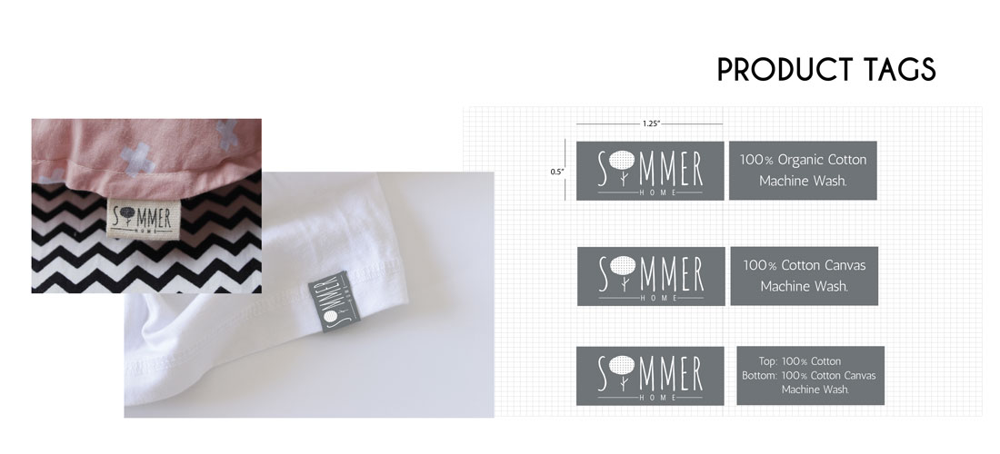
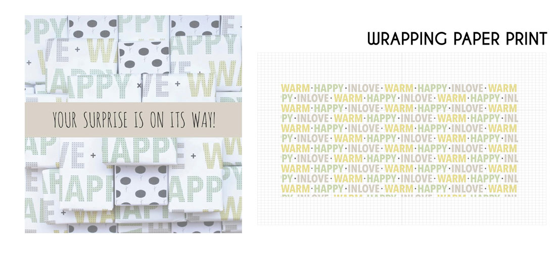
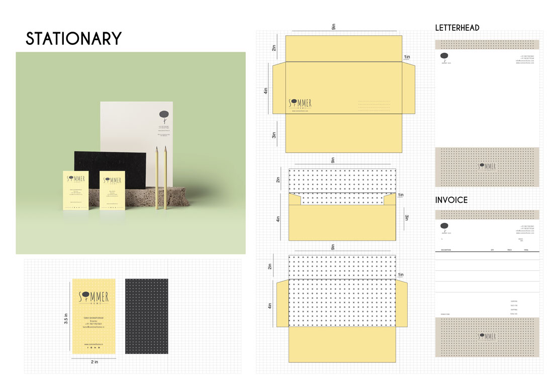
Since the brand is nordic inspired we tried to design the stationery with the repetitive pattern of cross and knots which is also continuation of the rest of the collaterals.
Their universe is deeply rooted in the Scandinavian design tradition characterized by minimal aesthetics, enduring functionality and bold creative thinking. Sommer Homes ambition is simple: Spreading the feeling of being warm.happy.inlove through their designs. They believe in the best for our kids. We believe in ‘Nordic Niceness’
